Typozon
He started with a spray can and a tag called Ozon. He ended up at TypeMedia in The Hague. Along the way: graffiti crews, Bogotá, a Rubén Fontana workshop, Type@Cooper in New York, and a typeface called Salvaje that became one of the most recognised releases to come out of Colombia.
The name was always there. Type + Ozon = Typozon. Bought the domain in 2005. Still using it now, except now it is a studio, a foundry, and a broader point of view on design shaped by collaborators on two continents.
My creative journey began before college, back in '97, when I was deeply involved in graffiti. I had a crew, and we were constantly painting and exploring different handwriting styles — tags, throw-ups, deltas, wildstyles — you name it. Later, when I pursued my Bachelor's Degree in Graphic Design, I fell in love with typography. It felt like the formal counterpart to the letter creation I had explored through graffiti. The studio started as an underground tag name for my graffiti work. Today, it's a space dedicated to helping others communicate their ideas. Type + Ozon = Typozon. I used that name since 2005 when I first bought the domain. Over time, Typozon has grown beyond just me.
Tell us about your creative process.
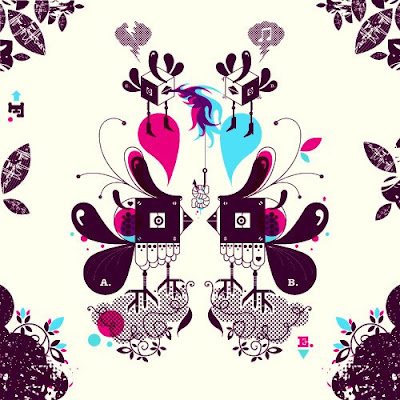
I mix natural elements — animals, plants — with urban scapes: cities, buildings, structures. To create analogies and contrasts between these two, and create new things. I'm always drawing in my sketch pad and I take some of those ideas to inspire my projects.
My design philosophy has evolved a lot since I first started. In the beginning, I was playing — exploring forms, colours, images, and concepts — but without a clear direction or defined ethos. Looking back, I think that was a good thing. Much like starting a new project, you don't always know where you're headed at first, but you experiment with the elements you have until things start to take shape. Eventually, clarity comes, and you begin to organise your ideas.
What led you to establish a foundry? Is there a story behind the name Typozon?
As I mentioned, I started out as a graffiti artist, and my tag back then was "Ozon." I used that name for years while painting. Before finishing college, I realised that typography had also become a big part of my identity. So, I combined the two — Type + Ozon — representing the intersection of art and design, expression and system.
After years of developing ideas, I launched my own foundry to publish typefaces I'd been working on throughout the past decade. The studio started as an underground tag name. Today, it's a space dedicated to helping others communicate their ideas — whether through new typefaces or branding guidance. What began as a side project has now become something much bigger.
"My design philosophy has evolved a lot since I first started. In the beginning, I was playing — exploring forms, colours, images, and concepts — but without a clear direction or defined ethos. Looking back, I think that was a good thing."
How is design in Latin America different from the US and Europe?
There is a difference in styles and shapes management, but the biggest difference in my opinion is the perception of colour. An example is that in the equator line, we have the same weather all the time, and in other countries seasons change, which affects the mood of the people so they experiment with colours based on the weather. Latin American people like contrast palettes of colours.
Graffiti. Tags, throw-ups, deltas, wildstyles. The original letter practice that everything else grew from.
Introduced to Fontographer. Created his first typeface, Pandilla. The spark that became a twenty-year practice.
A deeper understanding of type design — not just creating beautiful letters but building complete systems.
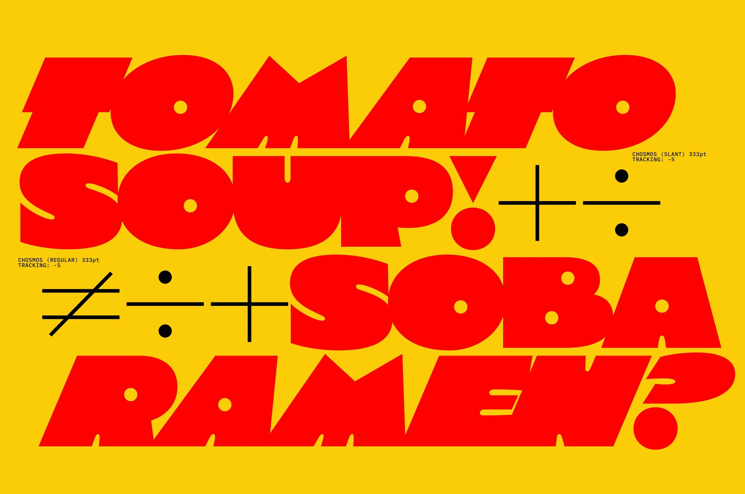
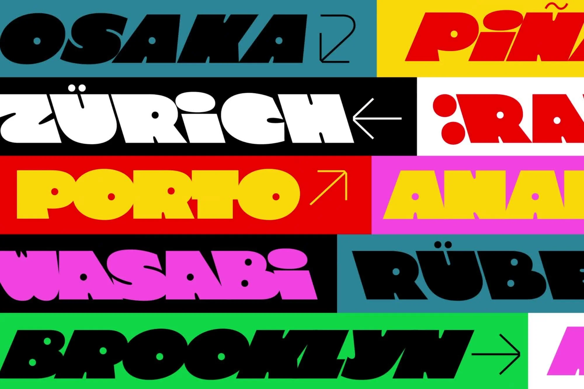
Graduation project: Salvaje Display and Text — released with Coppers and Brasses in 2018. One of Typozon's most recognised works.
On the equator, you have the same weather all the time. No seasons, no cycles of grey and white that train the eye toward restraint. The light is constant and it is intense, and Latin American colour — in design, in textiles, in the lingerie of Damascus, in the architecture of Bogotá — reflects that constancy. It is not excess. It is accuracy. The colour palettes Cristian Vargas works with are not louder than European palettes. They are more honest about the light they were made in.
The belief that colour and form have intrinsic emotional and psychological properties independent of what they represent. That a circle in blue is not neutral. A foundational idea for anyone who designs with colour as a system.
The ornamentation. The integration of letterform and image. The belief that type and illustration could live in the same plane without hierarchy, each informing the other. Directly relevant to the Typozon approach.
The decorative surface as structural argument. Pattern as meaning, not ornament. And the particular quality of gold as a design choice — how a single material decision can change the entire register of a composition.
Winner, Black and White Contest for the 15th anniversary of the magazine. One of the world's most respected graphic design publications.
International publication of Typozon work. One of the key European design annual publications that placed Colombian design on the global map.
All the best graphic design studios around the world. Typozon featured alongside studios from across the international scene.
My long-term plan is to continue working with current and new clients from all over the world. I would love getting to work with some of my favourite brands. I also want to work on more multipurpose projects that involve various design fields.
Right now I am planning to create a fashion brand called "GOLD School" — and am working to produce a sequel to a book I printed in 2007 called Loadind, a story book with a game of typography and illustrations.
An independent platform dedicated to artists, musicians, photographers, designers, and thinkers at every stage, from emerging voices to established masters. Every interview is selected for depth, not reach.
✦ EXPLORE ALL INTERVIEWS →"We need to support alternative films, art, any artistic form that challenges mainstream."
More personal essays and cultural commentary from Leila Antakly, on art, politics, wellness, and the complicated business of paying attention.
READ ON SUBSTACK ↗